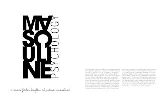
Ive been working on two different versions and I would really like to know if these are working. Which one is the better direction?
The colors look very different from what they look here. They look much more faded here and some of the pink type might look difficult to read but in the actual spreads they are not.
Version 1


Version 2


